It has been several months now since the release of Apple Arcade. I had a subscription for the first couple of months, then dropped out after I started my new role @Soho House and for whatever reason I spent all of my new-found commute time playing solitaire.
I was later enticed to re-join with the annual payment of £49.99 for the year (a saving of £9.98). I’ve enjoyed most of the games I’ve played on Apple Arcade, it’s liberating to have real mobile games, and not be continually pushed in-app purchases.

By far the best game that I have enjoyed is Assemble with Care, a narrative driven puzzle game where you have to assemble or repair various objects for people in a town the protagonist is visiting. The game starts by encouraging the player to wear headphones. Follow this advice, the audio is rich and incredibly immersive.
I would have liked for there to be more complex or challenging repairs. The game designers did a great job of keeping the puzzles at the right level to not be frustrating, perhaps adding more complexity would have pushed it too far. It was great to get lost in the repair, with the side characters standing over you to provide encouragement (or distraction). The small details were great.
There have recently been rumours that Apple has been cancelling contracts for games that are not so long lasting in favour of more engaging games often citing Grindstone as a positive example. I played Grindstone, I enjoyed Grindstone, I played Grindstone for many more hours than Assemble with Care.
That being said, games like Grindstone will never be the reason for me to pay for Apple Arcade. Games like Grindstone already exist on the App Store, but funded with in-app purchases instead of an annual subscription. I have no interest in only changing the business model. I am drawn to Apple Arcade because of its promise to move mobile gaming forward, to provide unique experiences that are not present elsewhere.
This year, due to coronavirus the conference was moved to be entirely online. For most people the WWDC was already online but this year was different. This year, without the constraints of a live physical audience, everything was pre-recorded. Overall this was a huge success and I would say that all of the sessions were tighter and easier to follow as a result.
My one criticism is that the keynote felt relentless. Compared to normal, everything felt compressed. Gaps in time where the audience is cheering, or speakers are alternating, which allowed the viewer to absorb an announcement or talk / tweet with others were almost entirely gone. I think Apple were aware of this problem as later on they had quite a few fun/gaudy transitions which I enjoyed, but I think there needed to be more.
macOS 11
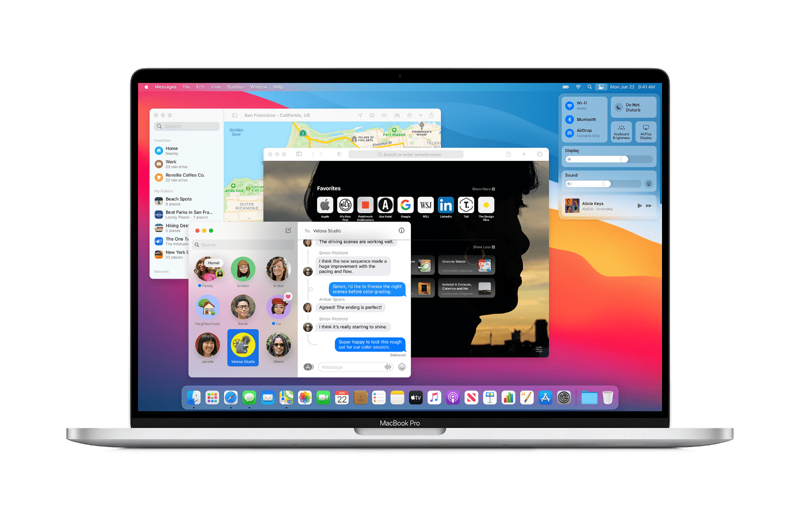
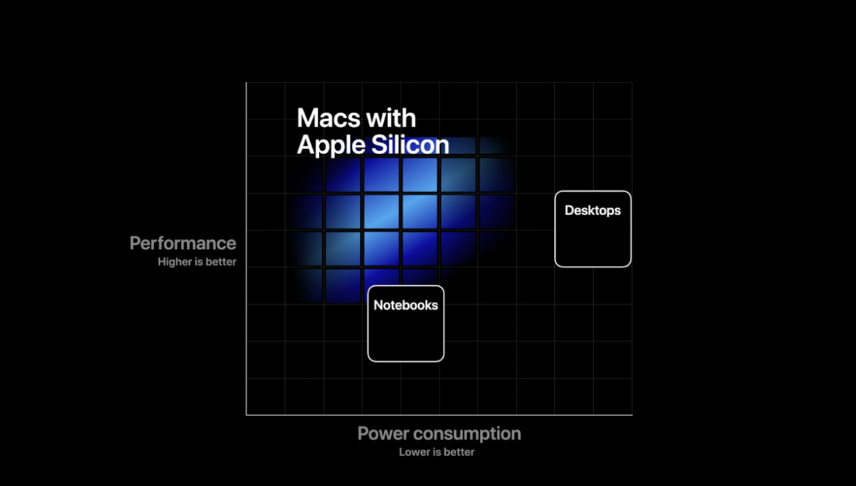
macOS certainly had the spotlight for most of the show. Everything has been redesigned to be more evocative of iOS design, but with a twist of macOS dimensionality. The biggest announcement was of course the transition to Apple Silicon. There has been much speculation as to the eventual performance of these systems, but Apple themselves have said very little. Their strongest statement was perhaps in the below image, which would seem to indicate that they occupy the power consumption range of a notebook processor, but with the performance covering the range of low-high end desktops. It remains to be seen how accurate this will be, but if it is then I will be at the front of the line to buy a new system.

Catalyst has received a lot of polish this year too, and I now believe it’s 100% possible to build great Mac apps using UIKit (which I fully intend to do). If developers don’t want to make a Mac app, that’s fine, the new Apple Silicon devices will allow people to run iPhone apps. I imagine many services, in particular banks, will not wish to release their apps for Mac. They should reconsider, I would relish having access to my Monzo or Natwest bank account from the place I am most productive.

iOS 14
Honestly, I barely remember the announcements for iOS the gravity around macOS was so consuming this year. There are a few notable improvements though.
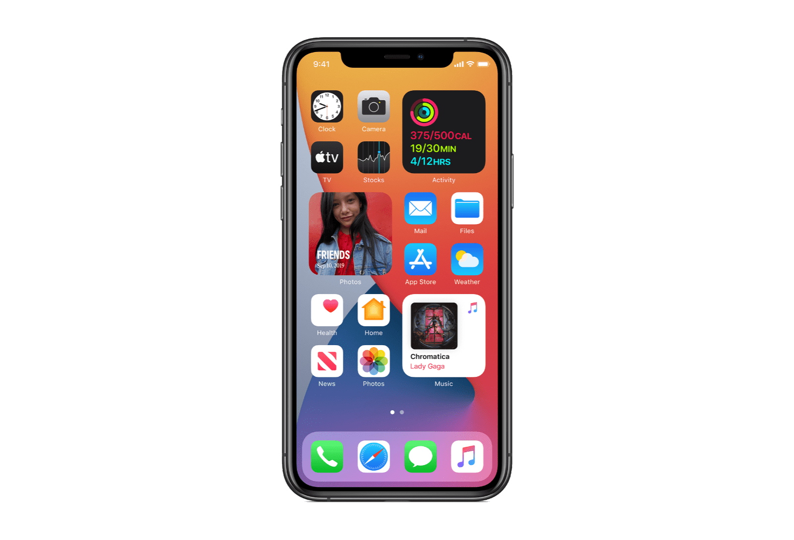
The home screen now has widgets. These are not the today view widgets we already have, which are tiny, but real, apps. These new widgets are a SwiftUI view hierarchy, combined with a date and a relevance. For now there is no deep interactivity, and the view hierarchy is static. The exception to the static rule is dates / times, which are the only things that can update dynamically. The way I have chosen to look at it is that an app can choose to provide a series of images, with the times that these images become relevant. These should use almost not additional battery power, which is pretty cool.

Another home screen update: you can turn off some pages of your home screen. All apps will then appear in a searchable app library. The app library search is entirely separate from spotlight, and spotlight seems to now de-emphasise app results. I’m hoping that latter behaviour will change before release as Spotlight was my primary method of launching apps that languished on page 3+, and significant muscle memory has been accrued for that method.
Picture in picture has made the jump from iPad to iPhone. I can’t wait for Youtube to continue to not implement this, and ruin the video watching experience for everyone.
App Clips look super cool, I really want to work with them. Unfortunately I don’t think I have any viable use for them right now.
What will have the most impact to developers of many apps is the change to permissions around IDFA usage. IDFA is the identifier for advertisers that can be used by marketings to track the effectiveness of their advertisements across apps. Using the IDFA will now require an up-front system alert, similar to those used for location. As an end-user there is simply no incentive for you to ever accept this. The IDFA is dead, move on, switch to fingerprinting if you want to stalk your customers.
Overall
This has been a good year. Every Apple platform has taken steps forward, and it truly feels like everything has progressed, and nothing has been left behind.
You may have recently seen in the news that R0 (the reproduction rate) in the U.K. has increased. This is concerning and we should all keep a close eye on the overall R value. However, it is wholly possible that R0 as dropped all over the country, but for the average value to appear flat, or even increase because of something known as Simpson’s Paradox.
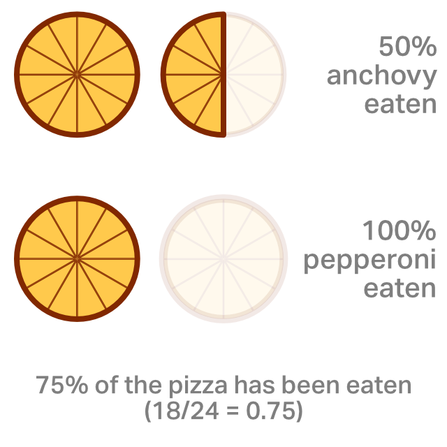
Imagine we have 2 large 12-slice pizzas. One is anchovy, the other is pepperoni. Pepperoni is more popular, and the rate of pizza consumption is 100% (Rpizza = 1). Anchovy is less popular, and the rate of consumption is only 50%! Out of 24 slices in total, 18 have been consumed. This represents an overall rate of pizza consumption of 75%.

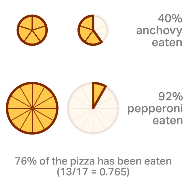
Now, because of a wide-scale weight loss program, everyone decides to eat less pizza. The anchovy pizza now only has 5 slices, but we have the same amount of pepperoni.
In the below example, only 11 slices of pepperoni have been eaten, and 2 slices of anchovy. We can rejoice, the rate of pizza consumption has gone down across the board! Only 92% of the pepperoni, and 40% of the anchovy pizza has been eaten! The overall picture tells a different tale. In total 13 slices of pizza were eaten out of 17 slices available in total. That works out to 76.5%! The percentage of the pizzas being consumed has gone up, even though: a) Less pizza is being consumed in total, b) Both pizzas have a lower percentage being eaten.

This has happened because the pizza with the lower Rpizza is no longer as represented in the overall figures. The same could be true for England’s R value. It could well be the case that transmission everywhere has reduced, but because the reduction in the normal community was so much more the R value is shifting to become a representation of transmission in hospitals and care homes. If the recent estimations of around 25 new infections in London per day prove to be accurate then this could well be the case.
This is a list of apps that I use regularly that I feel are uniquely interesting in some really cool ways. They each have features and aspects that, I feel, are worth paying attention to. Without any further delay:
1. OmniFocus 3

OmniFocus is a todo list manager that is great for Getting Things Done (GTD). It syncs between phone, iPad and Mac, has a liberal tagging system, you can add attachments to tasks and put them in projects and sub-projects. Tasks can be delayed and/or hidden until they’re relevant. This is a great tool for managing your personal tasks for work and at home.
2. Monzo Bank

Monzo (formally Mondo) is a relatively young challenger bank from London. If you have a good credit history they (currently) have nothing to offer in the traditional sense as you can get better rewards, loans, overdrafts, interest rates and credit cards elsewhere. What you get however, is an excellent place to manage your money from. When you open the app, you’re directly taken to your recent transactions. Your current balance and daily spending are right at the top in big letters with a line graph that illustrates your dwindling funds over the course of the month. Expenditure is automatically categorised so you can see how much you’re spending, and on what. Statement items show company logos, and opening them reveals the location of the store (if relevant) on a map.
Right after your first purchase when travelling you get a notification welcoming you to the country, with a very clear exchange rate. Every overseas purchase will list the local currency cost with the amount taken after conversion, they’ve really nailed down foreign transactions.
Monzo has multiple methods for sending and requesting money, but the way they handle traditional account number + sort code transactions is sublime. For any incoming transfer, the account details of the sender will be saved automatically, so if you ever need to pay them for a pizza further down the line you can do it without even asking for details. Outgoing transfers are similarly easy to setup, sort-codes are automatically parsed and the logo of the target bank is displayed which just adds an extra level of comfort that you’re typing the correct numbers. If the other person has a Monzo account then they’ll already be in your contacts, complete with a profile picture!
If you’re a developer working for a different banking app then please pay attention to Monzo, their app has close to everything you would want in a banking app without being gaudy (looking at you Sterling).
3. Tweetbot 5 for Twitter

Tweetbot 5 is an unofficial client for Twitter. It provides a cleaner, more iOS like experience for viewing Twitter. It has satisfying gestures for liking, or otherwise interacting with a tweet and supports multiple accounts with rapid hot-switching. It’s fast, and just about everything is 3d touchable so you can have a quick peek at people’s profiles without interrupting your flow when reading your timeline.
In the tab bar at the bottom, they have this crazy long press for extra tab options thing going on, so the final 2 tabs are actually 5 tabs, and you can customise both. It’s definitely an interesting way of having way more tabs of content, though I’m not sure it’s one I would want to use personally.
4. Castro Podcast Player

What I like about Castro more than anything is that it demonstrates how much is possible without a backend to manage accounts and send push notifications. New episodes are identified in background processing mode, and the rich notifications are triggered then. The inside of the app is extremely well geared to the role of playing podcasts with careful thought applied towards what people will want to do when listening. The bottom, like Apple Music, has the current playing status which can be swiped up from anywhere in the app. There’s an ever-present airplay button, which I’m a big fan of (looking at you YouTube, why would anyone want to play audio/video on a different device right?). Playback speed can be increased, voices can be picked out and enhanced and lengthy gaps of deafening silence can be automagically trimmed. The UI throughout can generally be described as big and bubbly.
5. CARROT Weather

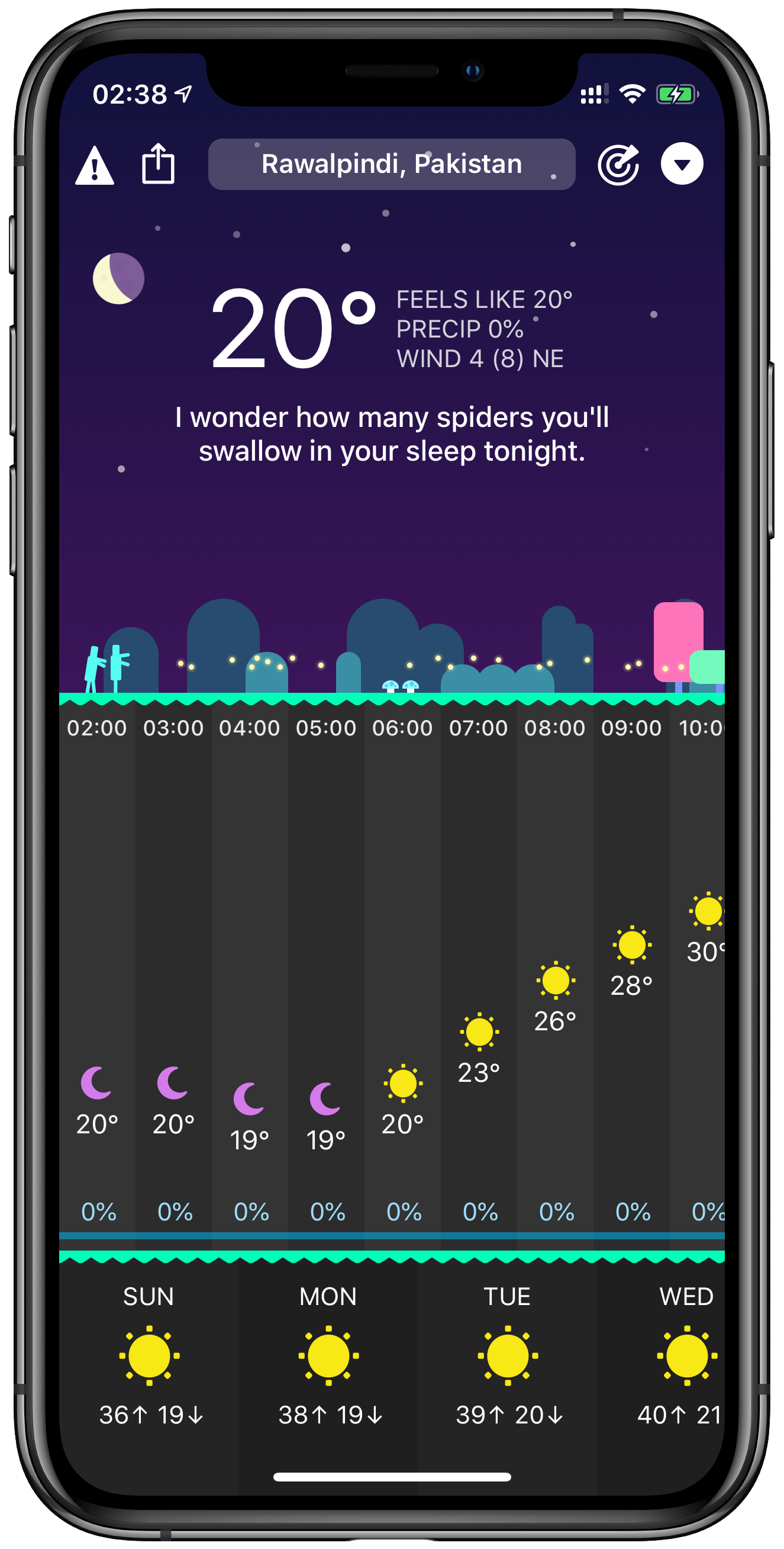
Elegant, joyous, amusing and useful; CARROT Weather is one of those rare apps that has it all. When you open the app, you’re immediately shown the current conditions for your area right at the top of the screen. The next section of the screen is dedicated to changing weather conditions over the next 9 or so hours, again everything is presented with lucid clarity. At the bottom, you have the changing conditions over the next few days, and you even get a witty, often topical and sometimes homicidal, remark thrown into the mix. All of this is packaged in wonderfully beautiful illustrations that echo the current weather.
If the app ended there it would be perfect, but the developer here clearly has too much time on their hands. The Apple Watch app is equally as elegant, there’s an AR mode where the weather can be presented by CARROT, you can rewind to previous weather conditions, there are achievements and there are also secret locations that are mostly (entirely?) based on movies. CARROT Weather makes the weather fun, which as a British sparks joy.

6. Babylon

I have no doubt that Babylon is the future of GP appointments in the UK. The app is a bit of a jumbled mess with far too many sections that should have been culled at the planning stage, but it’s functional. Booking an appointment is relatively straight forward and you can generally get a video appointment for the same day with little effort. The video calls work, and on the conclusion of your call the app will provide you with a transcript of everything that was discussed complete with any actions that you may need to take. If your medical issue needs to be escalated then you can be referred in the same manner as a traditional GP.
7. Halide Camera

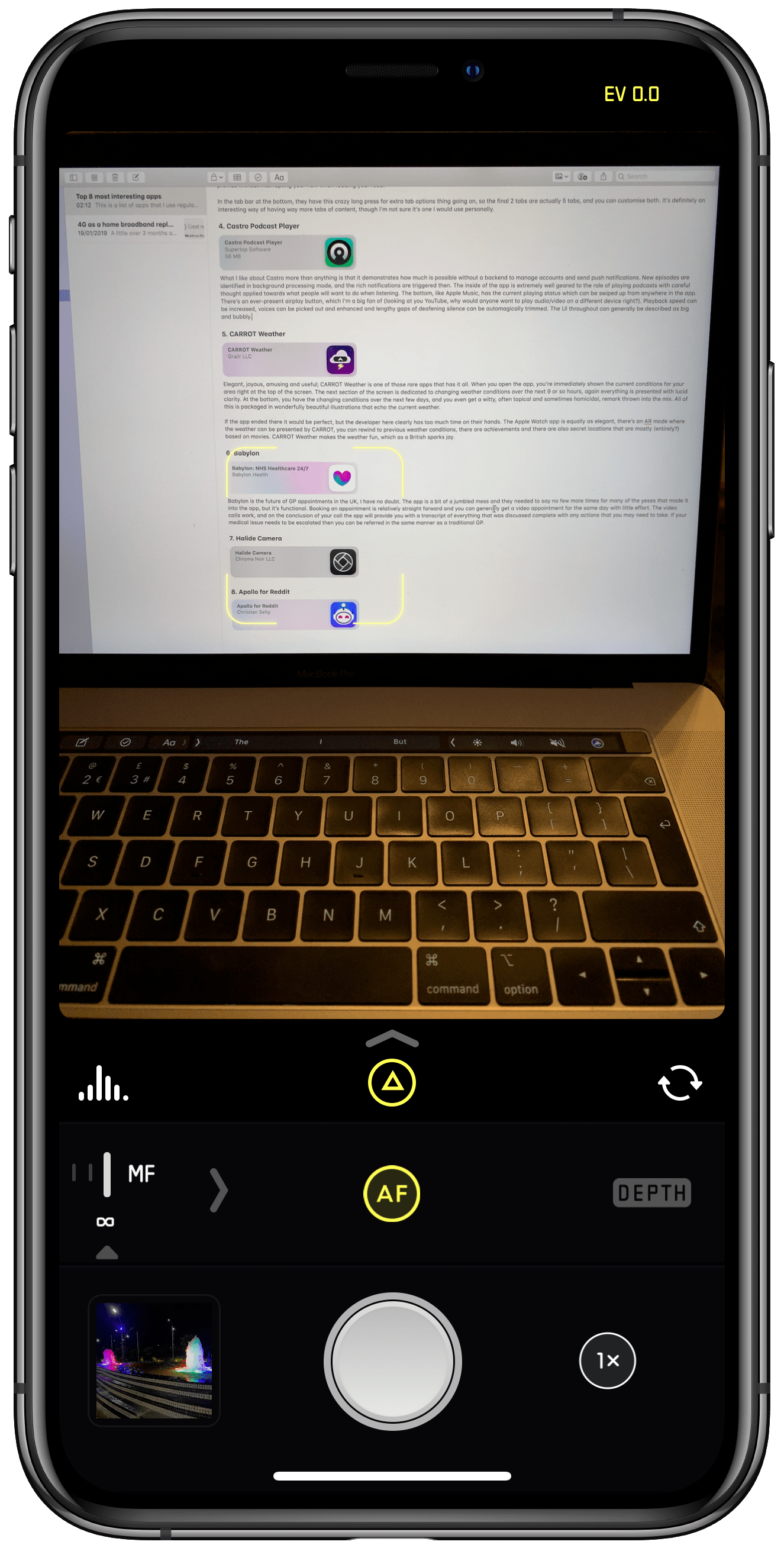
Halide Camera is an app for taking pictures but unlike the default camera app Halide offers far more control. Launch the app and you’re looking at a camera preview. Swipe across the bottom and you’re manually adjusting the focus. Tap the top right and you’re setting the exposure. Everything is quickly in reach. Further to this you can use portrait mode to take depth maps at the same time that you’re taking an image, and you can view the results in augmented reality! What is more impressive however is how fast the developer of Halide adjusted to the notch paradigm. I believe it was before the release of the iPhone X that the developer had already shown the EV indicator occupying the top right notch. I have yet to see another app utilise this narrow slice of real-estate so effectively.

8. Apollo for Reddit

Apollo for Reddit is like Tweetbot for Twitter, but for Reddit. I frankly spend too much time browsing memes in Apollo, and I can’t imagine a better interface for Reddit than this (and it seems that Reddit can’t either).
A little over 3 months ago I moved from Islington to west London. After a bit of searching I found an ideal place, cheap (ish, for London) and not too far from work. A cursory glance on SamKnows revealed that the exchange was fibre enabled so at a minimum we should be at least able to get FTTC. After moving in I went to order broadband from BT, and I was greeted with this:


Needless to say, this was not great news. After some further digging it was revealed that whilst the exchange was fibre ready, our specific cabinet was not (and with no plans in place to upgrade it).
With Virgin Media also not a viable option, I started investigating alternatives. Relish was the first option that sprung to mind, having seen advertisements on the Underground for their unlimited service. There were 2 problems however:
- No idea how good the signal would be at the apartment
- 10Mbps capped upload speed
I was not super enthusiastic about potentially locking us into a 12 month contract where the service might not even be viable. I did however know that I had close to perfect signal on my phone with my provider (EE) with whom I routinely get 140-200Mbps down and 40-80Mbps up.
Looking on their site, they were selling a contract with a home 4G router! There was one catch however, the service has caps with a different price at each of the following tiers:
- 100GB for £35/month
- 200GB for £50/month
- 300GB for £80/month
- 500GB for £100/month
Unsure of how much exactly I’d need, and with the assurances from the salesperson that we could upgrade our tier at any time, I started at 100GB. After setting up I initially only achieved 100 Kbps download speed, this was super concerning but after waiting for a couple of days the speeds picked up to ~70-80Mbps.
100GB This did not last very long, with that in mind we went up to 200GB. 200GB was mostly ok, but still felt constrained towards the end of the month. I didn’t want to feel constrained in that way, but I also didn’t want to pay £80 or £100 a month for internet. With some quick searching I determined that Netflix was our primary consumer of bandwidth at ~3GB per hour, and that by lowering the quality of the stream to medium we could reduce that to only 0.7GB per hour! Certainly the drop in quality was initially noticeable, but with time we grew accustomed to it and we can now comfortably reach the end of the month without being anxious about running out of internet.
The largest problem hurts, but is sadly unavoidable: the internet connection is NATed and as such Super Smash Bros ultimate does not work online.
Conclusion – is 4G home broadband viable?
For practically everything other than gaming: go for it, it’s definitely better than ADSL. For uploading it’s probably one of the best home products on the market. For gaming, at least in my experience, it’s not viable. Other non p2p online games probably will work fine, but Smash Bros does not.

